
Waitakere Primary School
CLIENT: WAITAKERE PRIMARY SCHOOL
PROJECT: SCHOOL BRANDING, LOGO, STATIONERY, SIGNAGE
This school branding project called for a fresh new logo for our local primary school. The school had built a new website, and realised that they really needed an updated logo – not the usual order to do it in but so nice to be asked to work on this project. The logo had to take cues not only from it’s environment but it’s existing logo which was very distinctive, and had a lot of history. The brief was to keep their wave icon but to modernise the whole look.
I also had to look at ways to move away from the existing colour palette of maroon and black to a fresher, more modern look. The maroon was replaced with a pohutukawa red, and paired with sea and sky tones of blue and teal for the main logo.
A new logo called for a refreshed stationery suite – business cards, folders, notepaper and certificates. The logo has since rolled out across signage and sports uniforms.


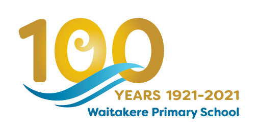
In 2021 Waitakere Primary School turns 100.
A logo was developed using elements from the school’s new logo to promote upcoming centennial celebrations.
see more of my recent work
© 2025 - Lesley Webb // City View Studio // All rights reserved